Design System: Interactive Cards
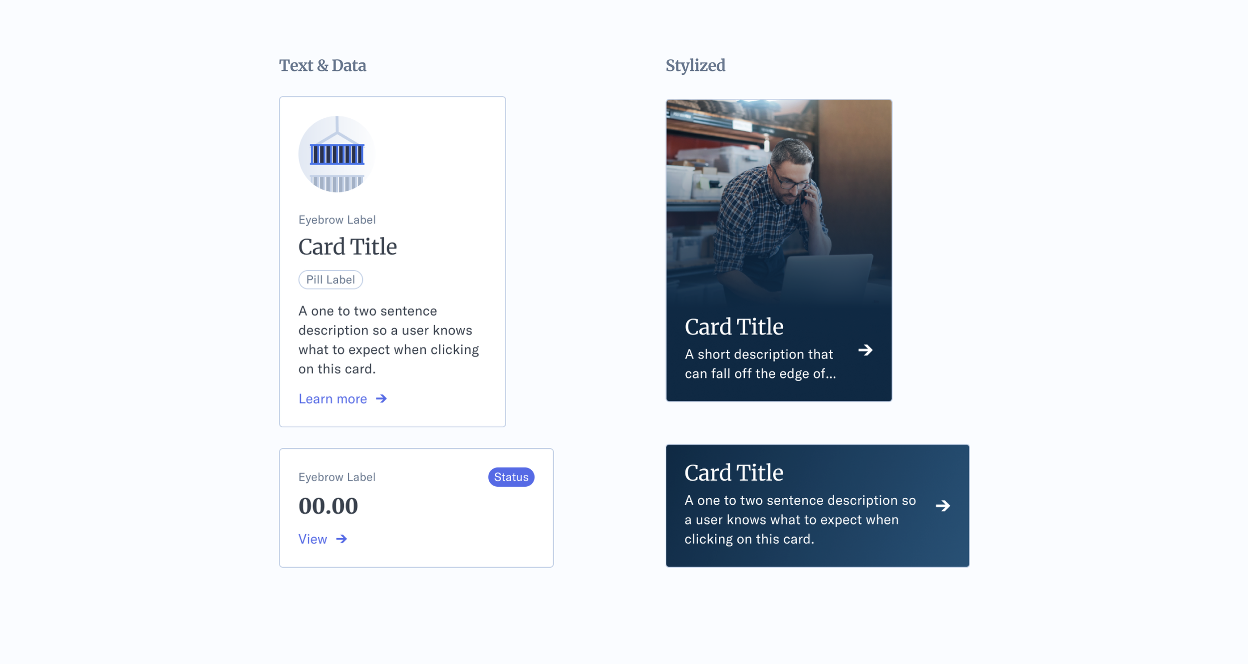
At the time, the design system was lacking a basic card component. Throughout the company’s products, cards and containers were misused, inconsistent and lacked guidelines. The goal was to tighten up the rules around when to use a card, the visual treatment and interactions. Based on common use cases, the system needed a simple text card, a data card and a more stylized card for marketing materials or upsells.
Role: Senior Visual Designer, Design Systems
Project Length: 3 weeks, 2022
Company: Freight Forwarder & Supply Chain Management
We needed consistent rules and behaviors.
Usage:
Cards serve as an overview and can contain an entry point for more detailed information.
Principles:
1) Cards need to be identifiable as a single container.
2) There should be no dependency on any other components/patterns.
3) The content and/or actions should not be vague or generalized.
4) Cards should not be nested within cards
Behaviors:
- Interactive Cards are clickable as a complete object and contains only one action.
- Cards will increase in size (responsive) when the area increases do to changes in the viewable area (browser). Cards will reorder (adaptive) respective to breakpoints being met, when the viewable area (browser) changes in size.
———
States.
Since the whole card is clickable, the element needed clear interactions.
Card Anatomy.
Clearly defined spacing was put into place. There are also elements within a card that is required (like a title and action) while other elements (like extra labels) are not required. Even though this is a pretty simplified card, the goal was to give product designers a starting point. Down the road, if designers are consistently adding a new element to cards (like a status), we would incorporate that into the design system element.
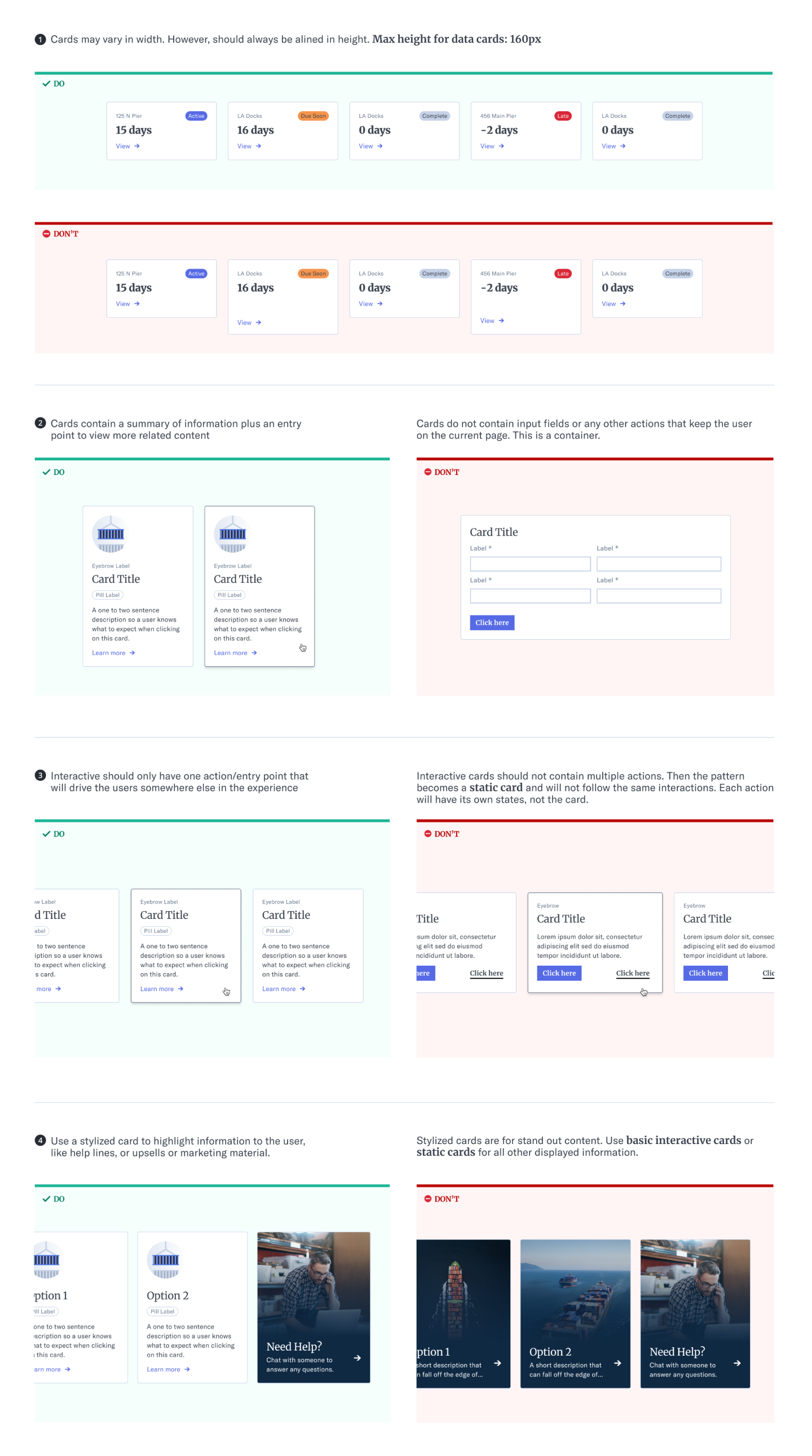
Simple Do’s and Dont’s.
Based on common mistakes observed throughout the products, as well as the questions asked by the product designers.


