Content Redesign for Student Financing.
Redesigning a landing page experience that guides students through difficult financial decisions by providing informative and easy to understand content.
This company was shifting from a transactional to an emotional brand that wants to build relationships with students. Their website is the most significant customer touchpoint with over 15 million visits in 2021 and they needed to bring their core web experience into alignment with the brand’s new mission and values.
Role: Visual Designer
Project Length: 3 weeks, 2021
Team: Creative Director, 4 Strategist, 1 Uxer
Project Type: Page & Content Redesign ready for build
Students expected loan and financing information hard to understand even before they started.
For students and parents, loans can be a mystery. It was important that we equipped the user with definitions of unfamiliar terms, break down the process and show a light on the best path for them.
Transparency.
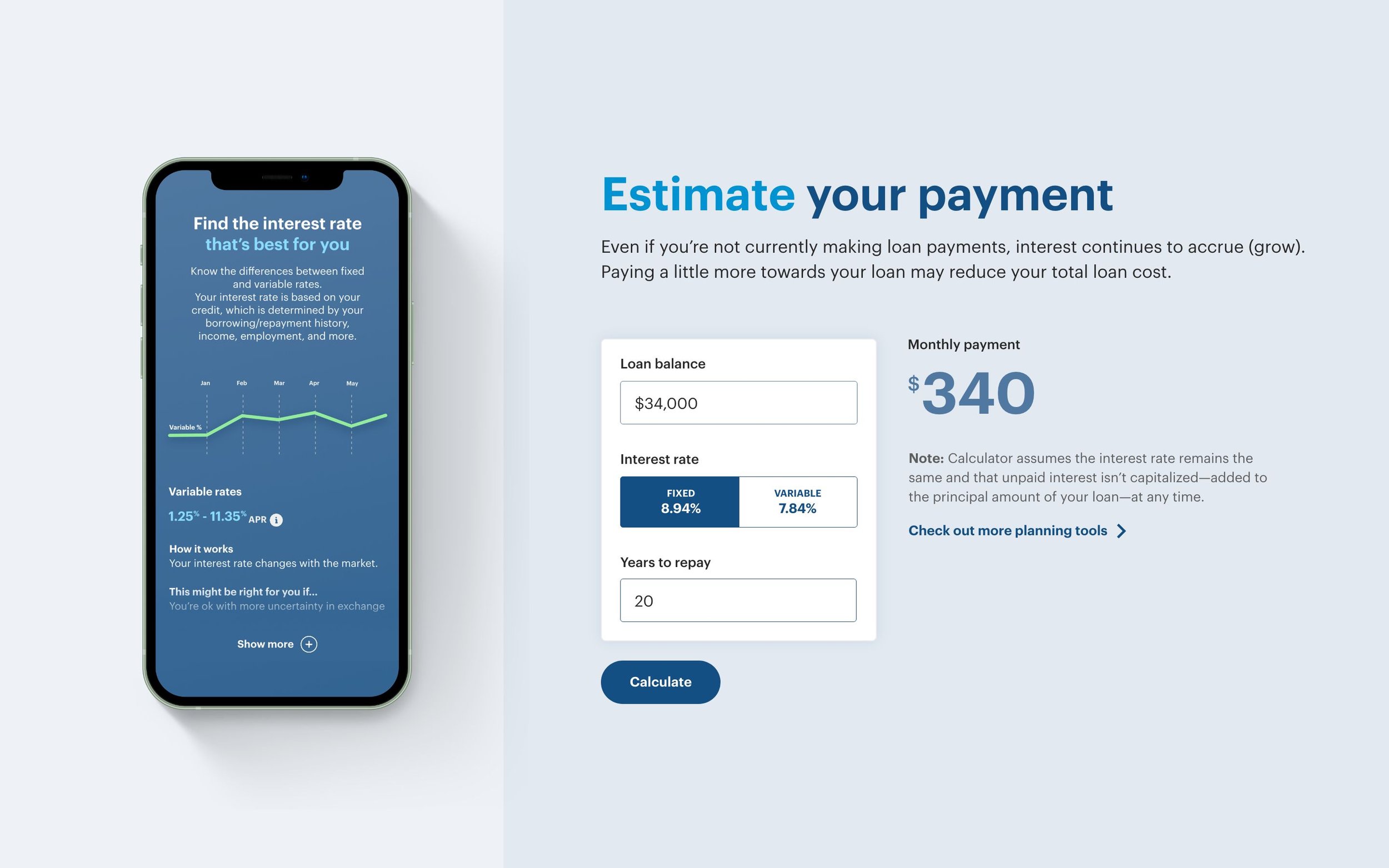
It’s important that users know the long terms impacts different kinds of loans have. For example interests, user resonated with copy that stated “this might be right for you if..” instead of definitions of variable versus fixed rates.
In addition, we wanted to give users tools to play around in order to visual what these terms and numbers could personally look like for them.
Reworking visuals.
Finances are overwhelming enough and majority of users come into the experience with the expectation that they simply won’t understand. Without stripping back all finance terminology, the team needed simple graphics for users to understand at a glance.


